Pick Up is a peer2peer car rental website designed to enhance the user experience in the car rental industry. Drawing inspiration from existing platforms, Pick Up aims to address and surpass the limitations often encountered in traditional car rental services. My primary focus has been to simplify the renter's journey, creating a seamless, efficient, and transparent process. While the current development focuses on the renter experience, the platform is fully equipped to integrate the owner's journey as well.
Through extensive research, I identified two critical pain points in the current market: the lengthy rental process and the lack of transparency in information. By addressing these issues, I have crafted a desktop website tailored to the preferences of our target audience. The result is a user-friendly interface that streamlines the rental process, providing clear and detailed information at every step to build trust and reliability.
This project was developed and produced during the UX Design Certificate course in the UX Institute. The idea, research, product development, design and prototyping of the website were performed along 5 months.
2024
Pick Up
UX Institute
Market Research, Usability tests, Affinity Diagram, Customer Diagram, Flow Diagram, Sketching, Wireframing, Prototyping, Follow-Up research
Step 2
Design a solution
During the Design phase of our peer-to-peer car rental platform, I translated the user research insights into a clear and actionable journey strategy. This phase was structured around several key steps, each offering unique learnings:
Affinity Diagram: I began by organizing user feedback into coherent clusters, to help pinpoint pain points, and positive insightsof the journey. This helped us identify recurring themes and prioritize critical issues, ensuring our design addressed the most pressing user needs. There were recurring themes highlighted such as intuitive navigation, clarity in information, and trust in the booking process.
Customer Journey Mapping: By mapping the entire rental process, I identified which step of the purchase journey users experienced more friction––the summary page. Our affinity diagram collected a lot of negative notes during this step, highlighting user's frustration on the poor information regarding the insurnance cover, and overall lack of transparency of the final price breakdown.
Flow Diagram for Desktop: Based on the previous user needs per step, I defined a detailed flow diagram outlining every interaction on the journey, from entering search criteria on the homepage to the final booking confirmation. This allowed us to streamline the process, ensuring that each step is logical, responsive, and easy to navigate.


Step 1
Research Methodologies
For this project, I used a combination of competitive benchmarking and usability testing to understand the user experience in the C2C car rental market.
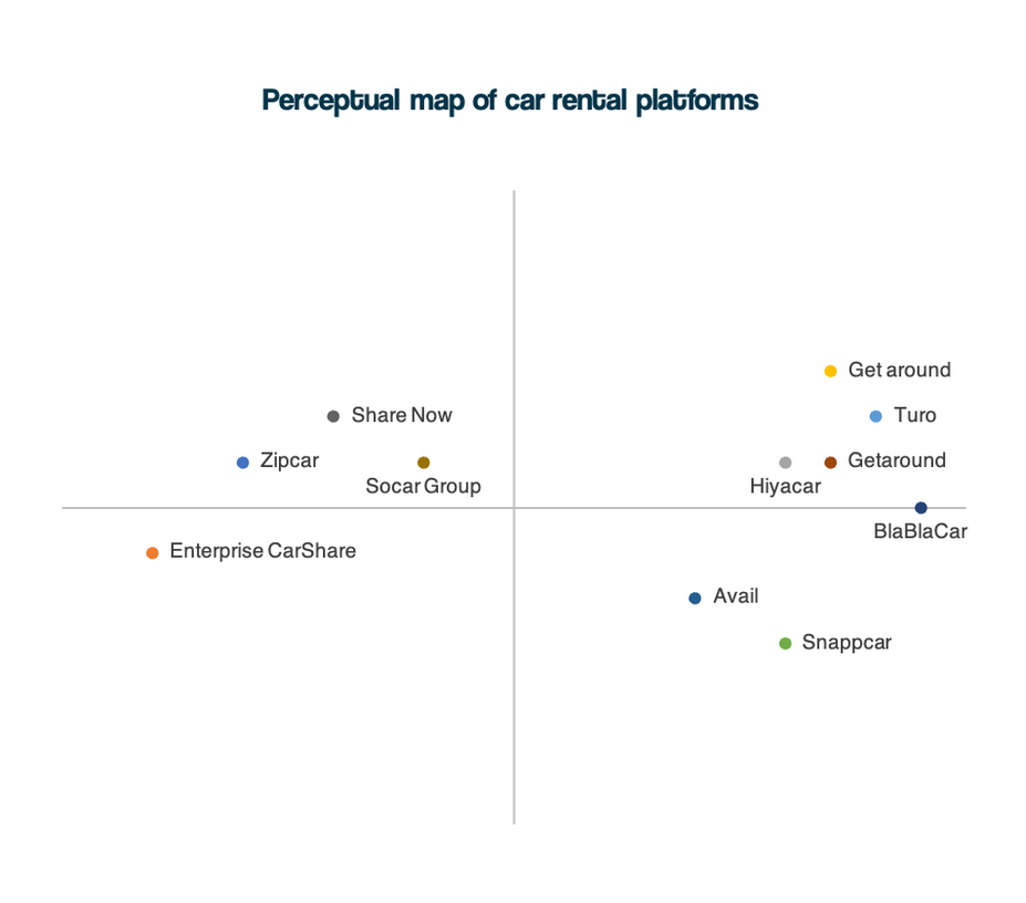
Competitive Benchmarking: I analyzed top competitors to evaluate their design, functionality, and user experience. This helped me identify industry standards and areas where we could improve.
Usability Tests: Firstly, I explored how users booked cars for both leisure and business trips, gathering insights on their decision-making process, price transparency issues, and navigation challenges. I observed how they interacted with search bars, filters, and calendars.
During these process I tested desktop platforms, from popular car rental websites like Sixt and GreenMotion, to peer 2 peer focused like Turo.com and Getaround.co.uk. Developing the same project on both platforms helped me understand the nuances of C2C platforms, and the key aspects for users in each of them.
Key insights
Transparency Issues: Users found pricing breakdowns confusing, especially regarding additional fees and insurance coverage.
Navigation & Usability: Search bars and filters were intuitive, but users struggled with date pickers and inconsistent car model displays.
Trust & Confidence: Peer-to-peer platforms raised concerns about vehicle reliability and pickup methods, requiring clearer explanations.
Comparison Behavior: Users preferred comparing multiple platforms before booking, emphasizing the need for easy side-by-side comparisons and clear pricing details.
Overall, the findings highlight a need for improved price transparency, clearer insurance information, and a smoother booking experience to enhance user trust and satisfaction in C2C car rental platforms.
Step 4
Wireframing and prototyping
In the final phase of our project, I focused on visually representing the Flow Diagram in individual pages and building an interactive prototype to bring our design to life. This phase was divided into three key steps:
Sketching: I started with basic hand-drawn sketches of each page, laying out the essential blocks required to facilitate the interaction throughought the main flow, address the needs the user will have in each page, and cover other journeys.
Wireframing: Next, I advanced to medium fidelity designs in greyscale, establishing a basic style library to serve as the foundation for the interface.
Prototyping: Finally, I developed a fully interactive prototype, connecting all pages to create a seamless process with intuitive navigation that allows different pathc to reach the same end goeal. This stage also involved preparing detailed documentation with notes for developers, ensuring that the final implementation aligned perfectly with our design vision.
An example of the prototype is available on the side for reference.


