In July 2022, Hays Group underwent a major rebrand to appeal to younger generations and promote the company’s tech driven approach. As the main designer in the Global team, I led the production of the first ever Digital Guidelines for Hays: a document that provides detailed guidance on the application of the new brand of digital assets.
The purpose of the Digital Guidelines is to enhance the Brand Guidelines, by considering elements in a digital context (e.g., user experiences; accessibility) and expanding the formats to include digital assets (e.g., buttons; forms). The document enables consistent and high-quality user experiences on all applications, while allowing flexibility for bespoke elements where required. The presentation of this document is in Figma, a common platform for designers, researchers, and developers. It includes a library and a set of components to be used by all regions.
This project was developed during my role as a UX/UI Designer at Hays,
Global Marketing.
2023
Hays Digital Guidelines
Hays Plc
Research, Creativity, Wireframing, Design
Components for multiple devices
Build a library of components adaptable to different devices
During the second phase of the implementation, we recreated and enhanced all our existing library of components following the new style guide. To make sure everything works smoothly on any device, we designed every component to be fully responsive, and created some additional ones (like burger menu, carousels, floating buttons...) to make the most of the tactile features on some devices. We touched on the following principles:
Scalability: Everything adjusts automatically to fit different screen sizes, whether you’re on a desktop, tablet, or phone.
Flexible Layouts: Our column system covers the different sizes to keeps content looking balanced and proportional, so nothing feels out of place, no matter the screen.
Touch-Friendly Design: Buttons and interactive elements have enough space to be easily tapped on mobile while still working perfectly with a mouse. Use of swipe on media cards and image lists.

Style Guide
Define a library of basic elements
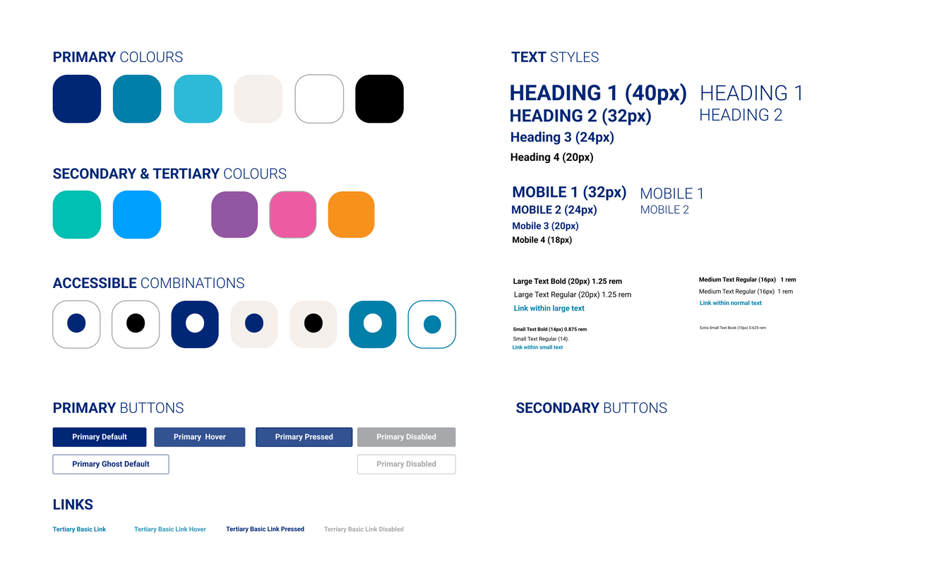
We started by creating a digital style guide, based on the original Brand guidelines, that stated the key visual elements that keep our brand looking and feeling consistent across all digital products.
Colours: Our colour palette is tailored for screens. We reorganised the priority on our colours from our original brand, making sure everything is easy to read and meets accessibility standards. We stick to our brand’s primary and secondary colours.
Text Styles: Clear, readable typography is a must. We’ve set specific fonts, sizes, and weights for headings, body text, and interactive elements so everything feels cohesive.
Buttons & UI Elements: Interactive components follow a structured design to keep things uniform. Button sizes, hover effects, and disabled states are all predefined to make sure they’re user-friendly and visually consistent.


